Editor’s Note: In this first installment of the Horror’s Top 10 presented by Forgotten Flix we hear from show artist and Horror/SciFi master Kevin Spencer from InkSpatters.com. We asked Kevin to give us his top 10 horror movie posters from the 1980s. Leave a comment below and let us know what you think.
***
What some people may not know is that even though I’m typically tapped for my artwork, I enjoy writing almost as much as I enjoy illustrating, which is why I was so excited when asked to write this piece. I approached this list with the mindset that even though I have seen all of these films, I wanted to look at each poster as a work of art and pick this Top 10 based from that perspective. I also didn’t want to base it on the popularity of the film. What I did find though, was that most of my picks are films that people would know.
In the 1980’s specifically, it seemed the posters coming out for Horror films were pretty bad in general. Most were action shots and just showed the villain or monster, which I am not a fan of. Horror film art seems to lend itself to the easy-out option (where you can show a bloody knife or a screaming woman and be done with it) more so than other genres. If you think about it, a poster with one of those images could probably be used for dozens of films but to me that’s a bit of a cop-out. So, without explaining away every thought I had in the process, let’s jump right in to my list. I hope you enjoy it and if you don’t… well, just be glad I’ll probably be back to strictly art duties after this.
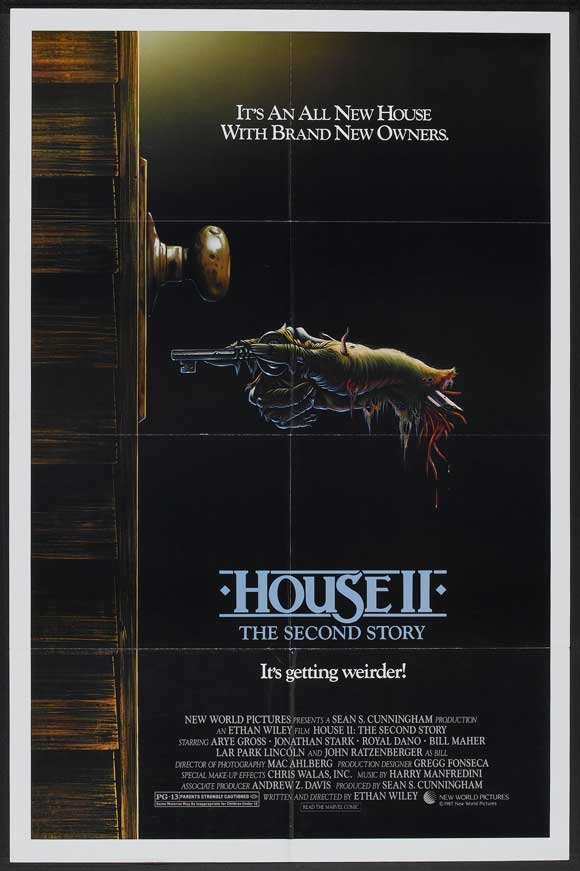
10. House 2-The Second Story (1987)
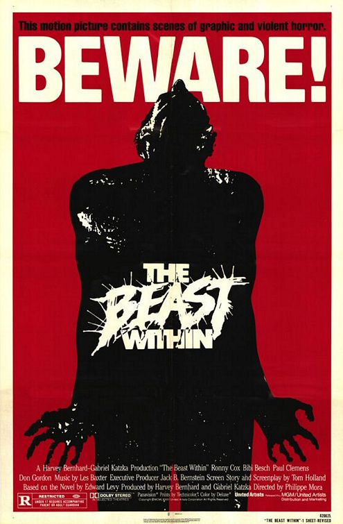
Come on, you can’t not laugh at the title. It’s genius. But that’s not why we’re here – we’re talking movie posters. I remember seeing this movie poster back when I was a kid as the dusty VHS sat on the shelf. The cover was exactly the same as the poster as was typical back in the 1980’s and really up until the 2000’s [until they started releasing 45 “Special” and “Super Special” editions of every movie made. I mean, do we really need a director’s cut of @#$&ing Battlefield Earth? But I digress. Back to my story.] I would look at the VHS case/poster of House 2 often as I’d peruse the Horror section of the local video store (back when they still existed) and I would think how cool the cover was. It’s a beautiful illustration with enough detail in the mangled hand and door to stand out on the solid black background. Plus, with a tagline “It’s getting weirder” how could you NOT love it?9. The Beast Within (1982)
This poster was one I found after some digging around on the ol’ interweb. The moment I saw it I loved it. I mean, you can’t overlook the giant BEWARE! jumping out at you even if you tried. It reminds me a lot of the old punk rock concert posters of the 70s and 80s – very simple but bold and effective. The figure is striking and the hands with the spread fingers are a very nice touch, illustrating that this poor guy, whoever he is, is in some serious pain. The white title truly stands out on the black character and the bold red frames both the character and the BEWARE! line perfectly. The black tagline at the top might have looked better in red but they probably decided it would have detracted from the BEWARE! Either way, this poster is awesome.
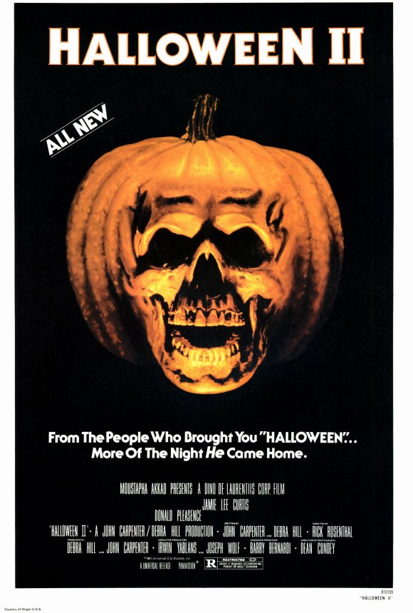
8. Halloween 2 (1981)
You’ll notice that most of my picks are posters that don’t give much of the movie away, and that’s on purpose. I hate when a poster gives too much away and in fact I hate when any promotional materials do that. Trailers have becomes almost unwatchable if you actually want to see the movie and go into it without knowing 95% of the plot. This poster does not fall into that category. It gives absolutely nothing away. By this point in time you’ve already been introduced to Michael Myers in the first film, so they could have done the bloody knife or the mask but they didn’t and I dig it. It is still however creepy as shit and still captures the ominous, eerie feel of the film.
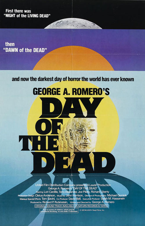
7. Day of the Dead (1985)
I won’t try to hide it. I love George A. Romero and I @#$&ing love zombies. I love the feel of Romero’s films and I love the creative way they tied his previous two entries in the series into this poster. It could have just been text and it would have been fine but the night/dawn/day concept is simply brilliant. The illustration is classic and actually reminds me a lot of a book cover. It’s not overdone but has nice little touches like the sun and the projected shadow of the word “dead”. It’s just a well-conceived and well-executed design that accomplishes what it set out to do.
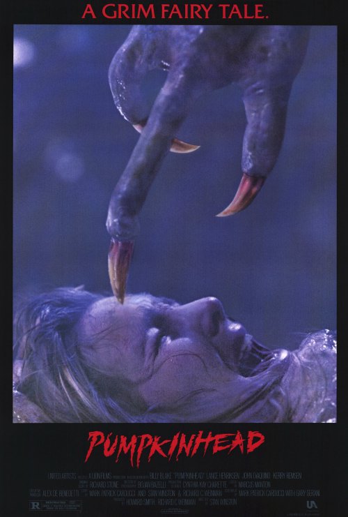
6. Pumpkinhead (1988)
The image used for this was the perfect shot. It shows an incredibly intense moment without revealing much of anything. They show a monster but so little of it you’d never know what Pumpkinhead actually looks like (other than the fact that he’s huge and he’s @#$&ing terrifying.) “A grim fairytale” is such a direct, matter-of-fact tagline that it suits the image perfectly.
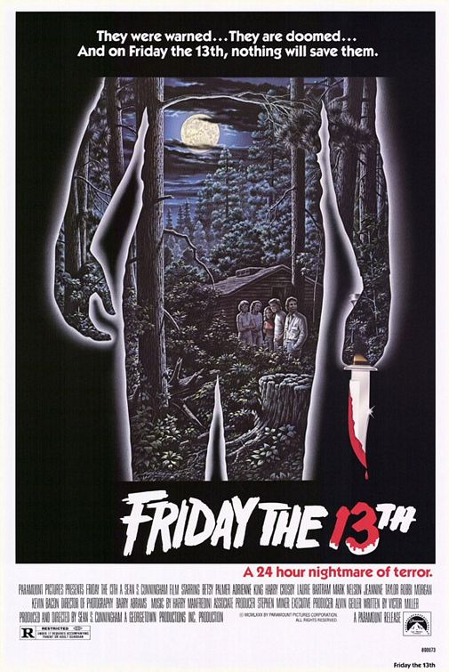
5. Friday the 13th (1980)
What makes this poster for me is the fact that it’s really two posters. First, it’s the scene of Camp Crystal Lake, with the group of teenagers outside one of the cabins on a dark, creepy-looking night. The illustration is very nicely done so that in itself could have been a very cool poster, but no, they decided to plop that idea right inside of a silhouette of the killer holding a bloody knife. In this case, the bloody knife works because it’s a secondary element. Also, I like how the silhouette cuts off before the head and it really doesn’t give away anything about the killer. The shape of the body leaves even the gender a complete mystery. So in this poster, they give you plenty of information but never reveal too much.
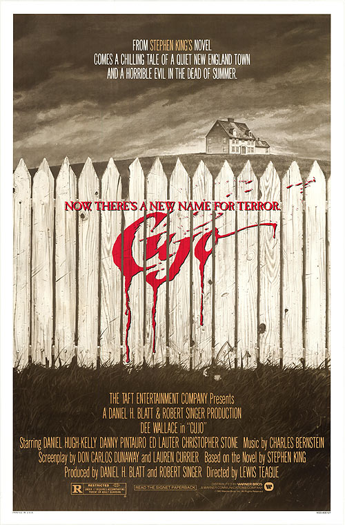
4. Cujo (1983)
Look at this poster. Look at it very carefully. If you don’t know who or what Cujo is, does anything on this poster give it away? Nope! And yet this poster is both compelling and terrifying. You could imagine that whoever Cujo is it might be just out of this shot and ready to tear you to pieces. I love that all the colors are muted with only the smallest hint of yellow before you get hit with that bold red of the tagline and title. The success is in the subtlety in this piece.
3. Child’s Play (1988)
Before I started writing this list I’d never actually seen this poster. I had only seen the classic ones with the Chucky the doll. This poster jumped out at me because it took me a long time to even confirm that it was indeed a Child’s Play poster and not a piece of fan art. I like that it plays off of Nightmare on Elm Street (released 4 years prior, with sequels coming out in 1985, 1986, 1987 and 1988). It’s a smart marketing technique and it does it in a clever way that doesn’t come across as overly obvious. I mean, it’s pretty obvious they used the same font used on the Nightmare on Elm Street films but at the same time it’s not bothersome. The illustration is a wonderful low-angle shot that gives nothing away about Chucky or the plot of the film.
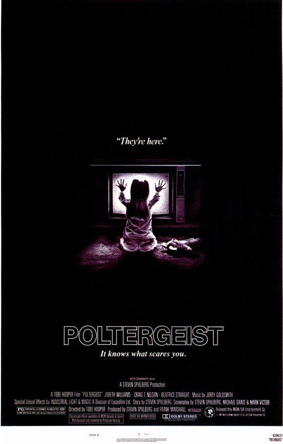
2. Poltergeist
This poster is scary. It’s simple yet highly effective. The dense black and lack of a background is visually unsettling and the “They’re here” tagline just solidifies the notion that this movie is going to have you watching through covered eyes. Using the TV static glow as the only light source is brilliant and definitely sets the shit-your-pants vibe. It doesn’t give much of the movie away but has obvious connections.
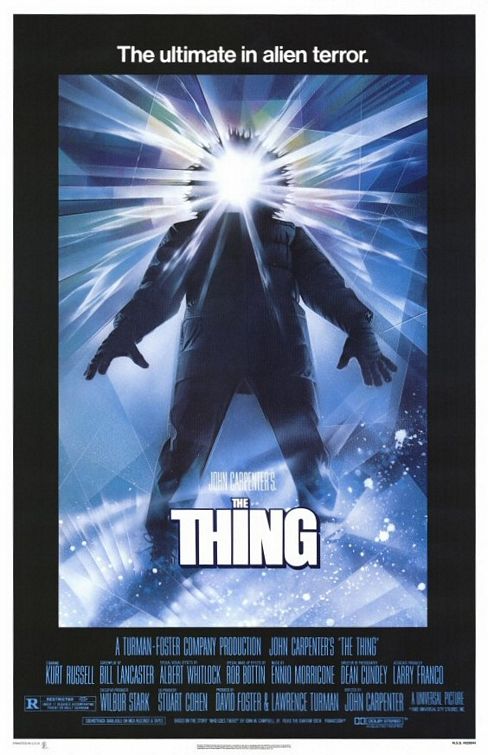
1. The Thing
I’ll be the first to admit that this is one of my all-time favorite films. Beyond that admission, I would love this poster even if I hated the movie. It’s just awesome. I feel bad even calling it a poster because it really is more of a piece of art than any of the others and I really do hope that somewhere the original is framed on someone’s wall.

